BartSimpson BartSimpson:
Cute chart.
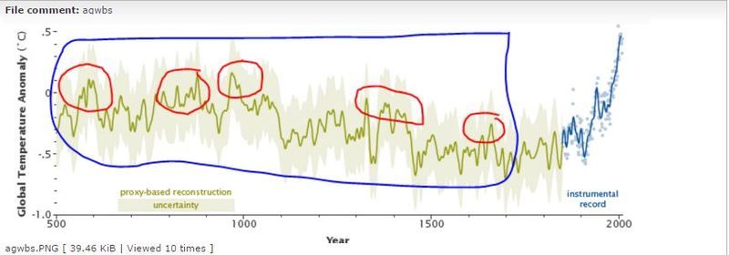
So what caused the warming noted in the red circles and what caused all of the temperature variations noted in the blue circle since man isn't the cause?
I think I can explain it.
First of all, I've seen charts for that period, but the blue zooming up above the others wasn't there.
That one seems to be a variation of what they were calling "Mike's Nature Trick" in the Climategate emails. Basically it seems to be, more or less, "Hide the decline."
They use a proxy record of temps for way back when, but they can't continue it with proxy temps into the present, because if they did those temperatures would decline. So they paste the instrument-measured, land surface temperature record at the end. The previous peaks and valleys in the green are there, because that's what the selected proxies show temps doing. The blue is skyrocketing upwards above the proxy record, because that's what the instrument-measured, land surface record shows when you compare it to their selected proxies. "Apples and oranges are the same if it says what we want it to," you see.
Nevertheless it's like you say. What they can't hide is there's warming and cooling no matter what.


") CKA Uber
CKA Uber 


") CKA Moderator
CKA Moderator 


![[drool]](./images/smilies/droolies.GIF "Drool")

